Start with the journey, not the sign
A useful wayfinding system helps someone answer three questions: Where am I? Which way should I go? Have I reached the right place? Before choosing fonts or symbols, walk through the space as a first-time visitor might. Start at each entrance and follow common trips, such as finding reception, a meeting room, a toilet or an exit. Notice where a person must choose between routes and where they might need reassurance that they are still going the right way.
Keep names consistent across signs, maps and information given before a visit. If a room is called the Community Hall on the entrance sign, avoid calling it the Main Room farther along the route. Where several destinations share a direction, group them so a visitor can scan one clear message rather than compare competing signs.
Place signs where decisions happen
Put directional signs before a turn or junction, with enough space for someone to notice them and choose a route. Follow up after the turn if the destination is not yet visible. At the destination, provide an identification sign that can be seen without standing in a doorway or crossing another person’s path. A sign that looks prominent on a design plan may be hidden in practice by an open door, a queue, furniture or a temporary display.
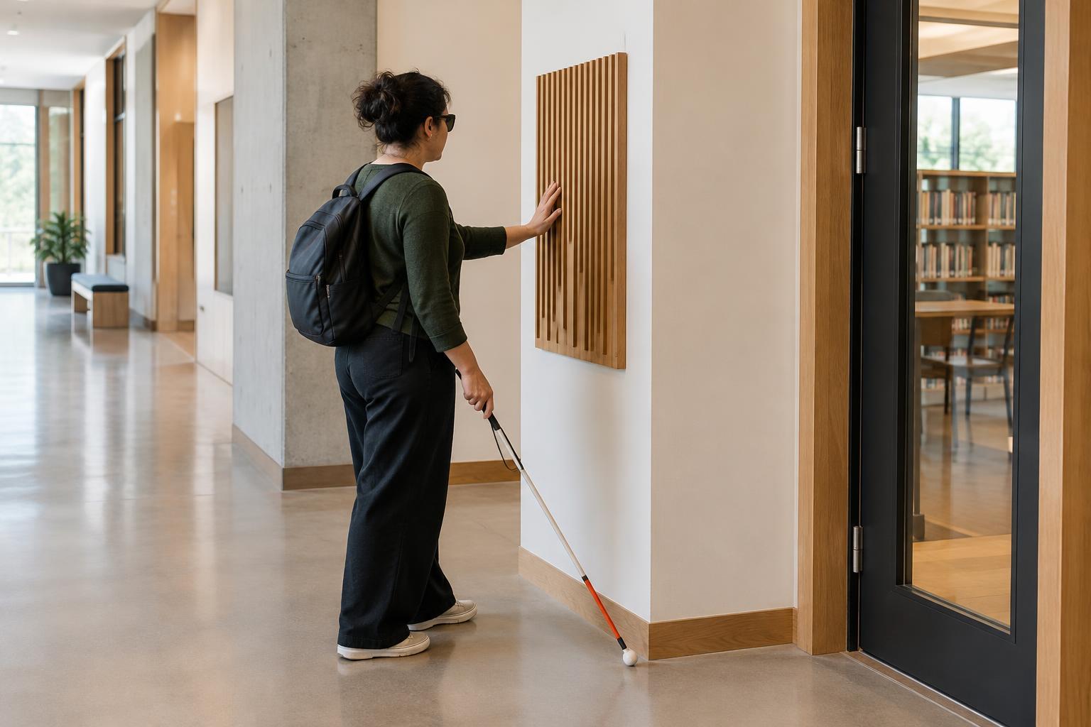
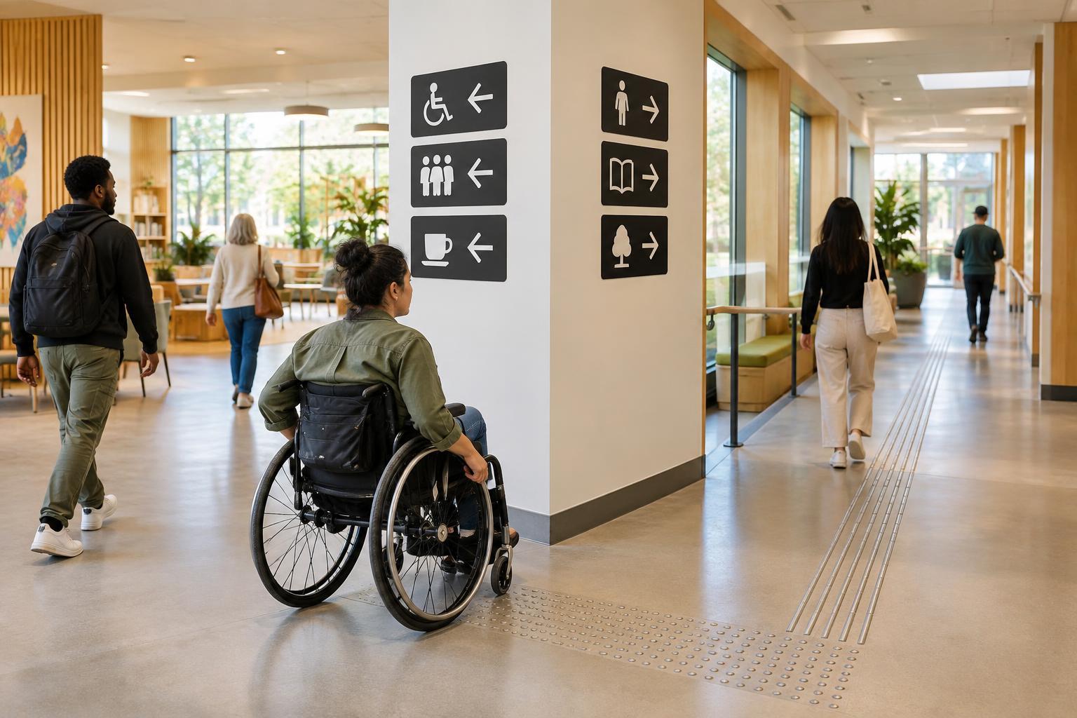
Consider how people approach the sign. Someone seated or using a mobility aid may have a different sightline from someone standing. Crowded walls and overhead signs can also be difficult to spot from certain positions. Check signs from multiple approaches and distances, in both quieter and busier conditions. If a route has stairs and an accessible alternative, give the alternative route clear, continuous directions rather than leaving people to discover it at the stairs.
Make the words easy to read and act on
Use short, familiar labels that name destinations directly: “Toilets” or “Reception” is usually quicker to understand than a clever name that needs explaining. Put the most important information first. A sign at a junction rarely needs a full sentence; the destination and a clear arrow may be enough. Save detailed explanations for a map or information point where people can pause.
Choose a simple typeface with letterforms that are easy to distinguish, and give the words enough size and spacing for their viewing distance. Avoid squeezing text to fit a small sign. Strong contrast between lettering and background matters, as does the sign’s surroundings: reflections, shadows and patterned surfaces can make otherwise clear text harder to read. Test a sample in its intended location rather than judging it only on a screen. Readability depends on lighting, distance and the angle of approach.
Use symbols to support words
Symbols can help people scan quickly and may support visitors who use different languages. They work best when their meaning is familiar or easy to learn. Pair a symbol with a short text label, especially for destinations that do not have a widely recognized icon. Use the same symbol for the same destination throughout the building, and keep arrows visually separate enough that their direction is unmistakable.
Do not rely on color alone to distinguish routes or areas. If a blue route and a green route lead to different places, label them as well. Think carefully about what a symbol assumes: an image that seems obvious to one person may be unfamiliar or misleading to another. When a sign matters for safety or access, clarity is more valuable than a decorative theme.
Test the route and keep it reliable
Ask people who do not know the space to find a few destinations using the signs alone. Watch for hesitation, missed turns and moments when someone has to retrace their steps. Invite feedback from people with varied access needs, and make it easy to describe what was confusing. A small test can reveal whether the problem is the wording, the sign’s position or a gap in the sequence.
Review signs whenever rooms change names, routes close or furniture moves. Temporary directions should be as clear as permanent ones and should not cover essential information. Wayfinding is not a single sign at the entrance; it is a connected set of cues that supports people from arrival to destination and back again.